California College of the Arts:
Direct Mail Letter Design
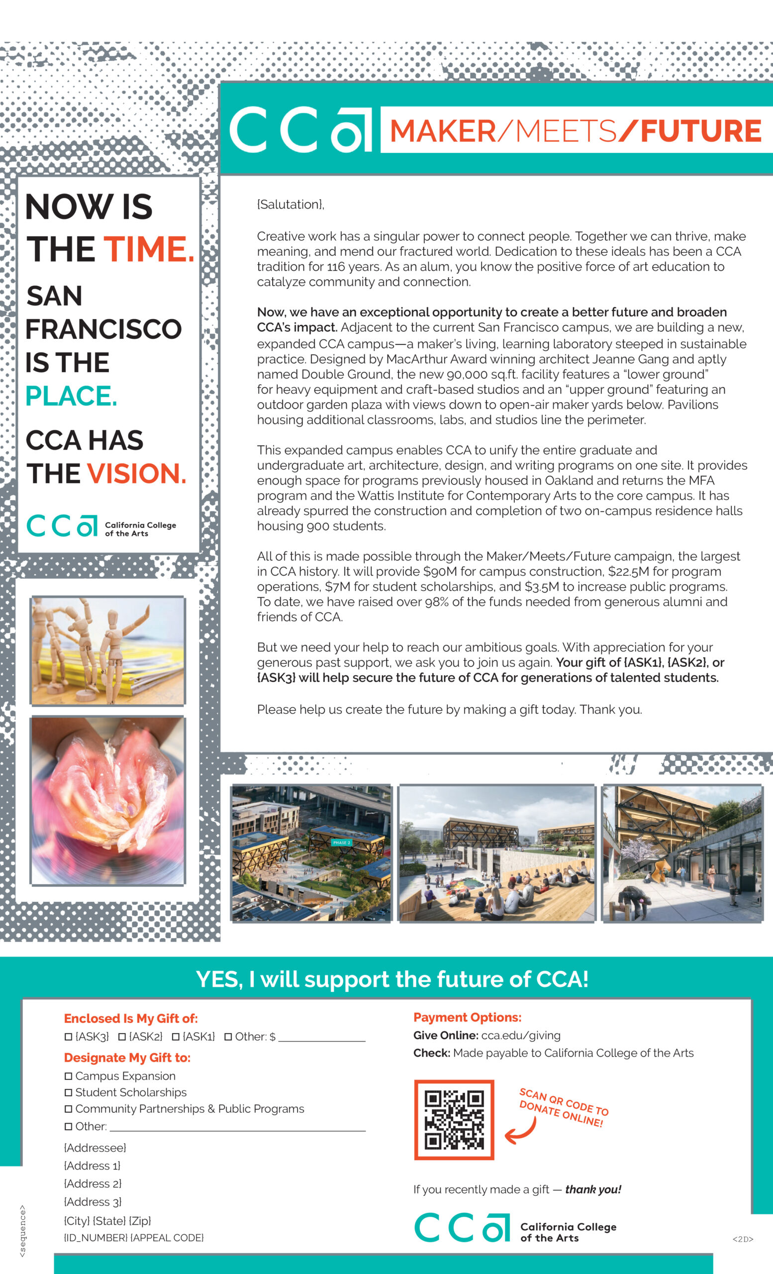
For this project with CCA, I drew heavily from their branding and style guides to create a design that felt both bold and unmistakably theirs.
The foundation of the letter’s design is built around key brand elements — halftone patterns and blocky geometric shapes — which provided a strong, structured visual framework. I selected turquoise and orange from their official color palette to bring the piece to life, using the vibrant contrast between the two to create a dynamic, visually engaging balance.
The result is a design that feels energetic, cohesive, and true to CCA’s distinctive visual identity.

TIP: Hover on image to navigate and click on image to enlarge