Bridgewater State:
Postcard and Digital Ads
Bridgewater State University presented a unique design challenge, with a highly detailed brand guide outlining everything from specific graphic elements to exact border thicknesses.
Navigating these strict parameters required a careful balance of creativity and precision.
I worked thoughtfully within their guidelines to develop pieces that not only met their stringent requirements but also felt polished, engaging, and true to the university’s identity.
Despite the challenges, I’m proud of the final designs — they demonstrate how strong creative
solutions can thrive even within the tightest brand frameworks.
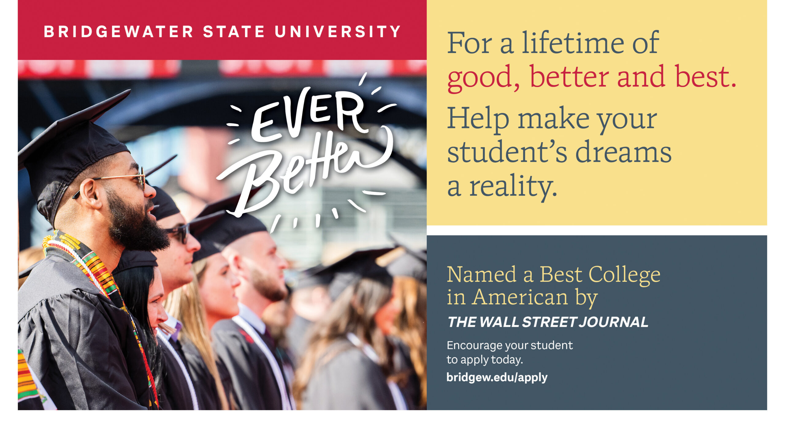
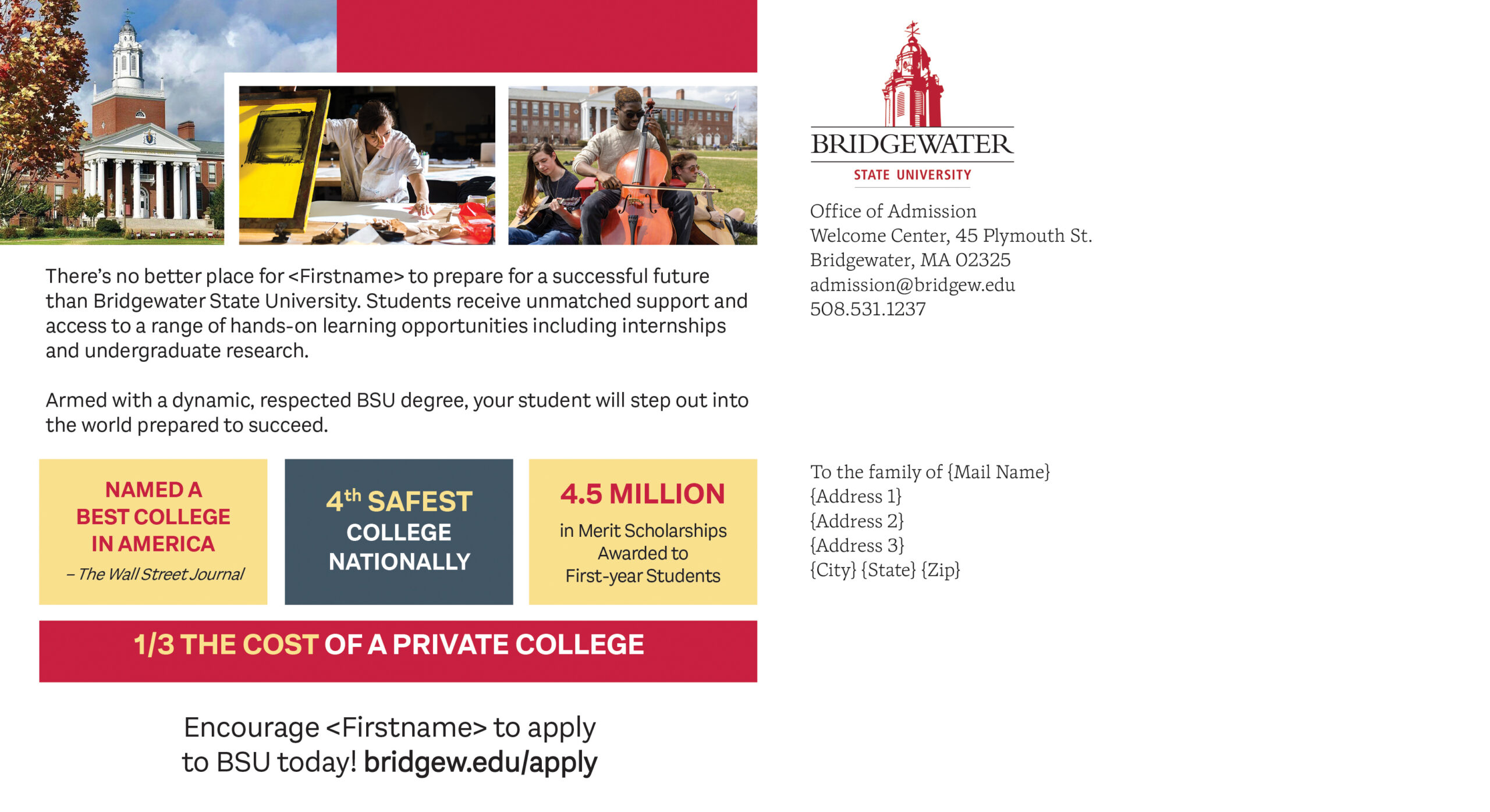
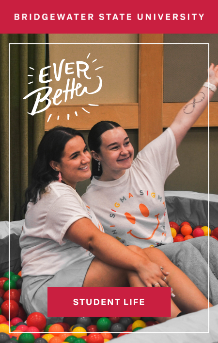
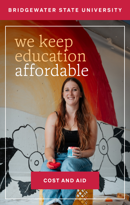
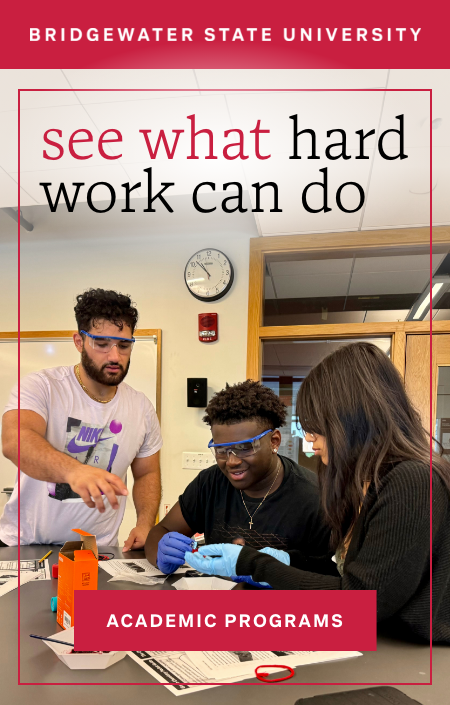
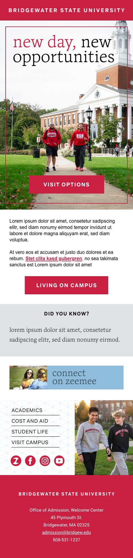
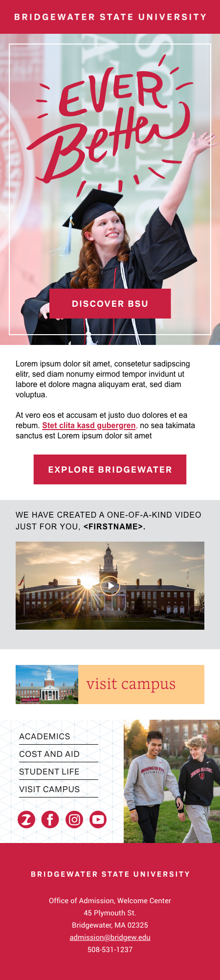
When designing both the Parent Postcard and the email templates for Bridgewater State University, I focused on creating a clean, structured look that aligned seamlessly with their established brand identity.
I chose a bold, block-based layout to complement their logo design, which is framed within a prominent red rectangle — a key visual anchor across their materials. Staying true to their detailed branding guidelines, I also incorporated their pre-made vector graphics featuring catchphrases like “Ever Better,” using them thoughtfully to reinforce the university’s messaging in a cohesive, polished way.
The final designs balance simplicity with brand strength, creating clear, visually engaging communications that feel both modern and very much Bridgewater.
TIP: Hover on image to navigate and click on image to enlarge
Email Heroes and Templates
TIP: Click on image to enlarge